Goodie Bag
Grocery shopping shouldn't be complicated, it should be easy and accessible to everyone. Goodie Bag is a mobile and web application that was created with people of all ages in mind. Shop and order groceries whenever you want and wherever you are.
My Role
UX/UI Designer
Timeline
1.2021 - 1.2021
Tools Used
Adobe Xd
— The Objective
Grocery shopping should be easy and accessible and I kept that in mind with every step in creating Goodie Bag. I wanted people of all ages to be able to comfortably use Goodie Bag and no step feel limited on who could use it. It's important that someone in any age group open the app, know what was going on and efficiently shop and complete their order. I knew that the easiest way to achieve this was keep the design extremely simple and legible. Nothin' fancy, just following the saying "keep it simple stupid."
— Purpose & Context
This is my 4th and last student project. I chose the "online store" brief, and Goodie Bag is what I came up with.
— My Design Process
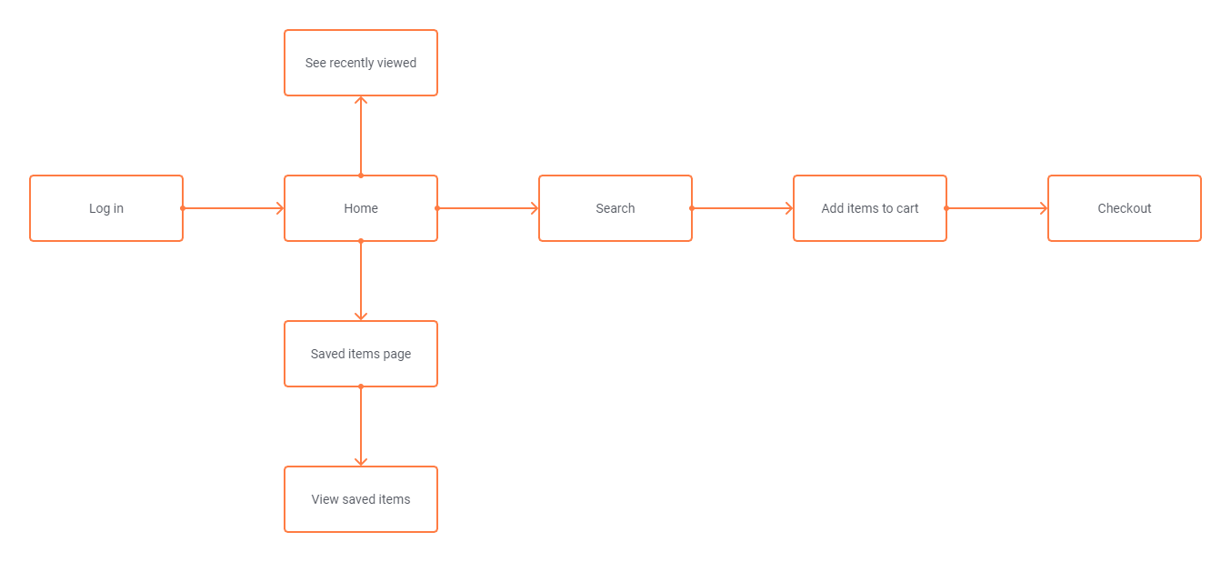
I started with some research on other grocery ordering apps and took note of what users said they liked and disliked. I then moved on to a basic user flow and created low-fidelity wireframes. I then visually put everything together in a style guide.


— User Testing
I asked 3 users to test under this scenario while looking at a prototype of my low-fidelity wireframes (shown above):
"As a customer, I want to be able to place multiple items in a shopping cart, so that I can purchase more than one item at a time."
And gave steps to follow:
1. Navigate to and click on the search bar. Pretend you've searched "fruits"
2. The first result should be oranges. Click on the item.
3. Now you're viewing the item as if you were wanting to purchase it. How does this look?
4. Add it to your cart!
5. Please be honest about anything you liked or disliked!
Feedback I received:
“I think you should make the item price bigger once you click on it”
“A clarification under the heart on the viewed item page might help users understand what that is for”
“A filter icon on the home page would be nice as well”
I thought the feedback was great and all of it was implemented and helped me finalize my designs!
